
MerryBank Web App
How I designed cohesive brand and UI experiences for the MerryBank web app.
MerryBank is a new bank looking to release a minimum viable product to the market. Their goal is to provide an automated process that assists people with saving money by separating their funds into savings buckets. Users will have control over their savings and greater visibility into their spending.
My task was to expand on the UX research that had been conducted and to complete the UI design of their website. Furthermore, since the branding had not yet been established, I was also responsible for creating the main brand elements.
My role
Product Designer
High fidelity prototype, UI flow, user testing, component library
Visual Designer
Brand design, style guide, marketing assets
Client
Personal project
Deliverables
Mobile and desktop web app
Component library
Brand assets
Outcomes
Comprehensive new branding reflected in the logo, marketing assets, and product UI.
Enhanced user experience for creating and editing saving buckets.

Branding
The MerryBank brand personality can be summarised in three words: trustworthy, friendly, and energetic. My aim is to create a style that evokes warmth without compromising professionalism. Every element, from photography to UI components, should support each other in building the brand, therefore providing a holistic approach to branding that extends from digital products to print.
The logo is simple, timeless, and friendly, featuring round cornered overlaying shapes that can expand into brand elements.
The colour palette consists of warm tones, with blue signifying security and orange representing energy.
The typography font pairing combines a unique grotesque font for headings with a neutral sans serif font for body text. This gives distinctiveness without compromising legibility.
Cards and buttons use round corners to convey friendliness.
Photography incorporates a pop of brand color for energy.
Bespoke spot illustrations were created with thin lines to maintain a professional yet unique appearance.
The graphic elements are dynamic and versatile, allowing for brand expansion.

MerryBank brand style tile
UX insights
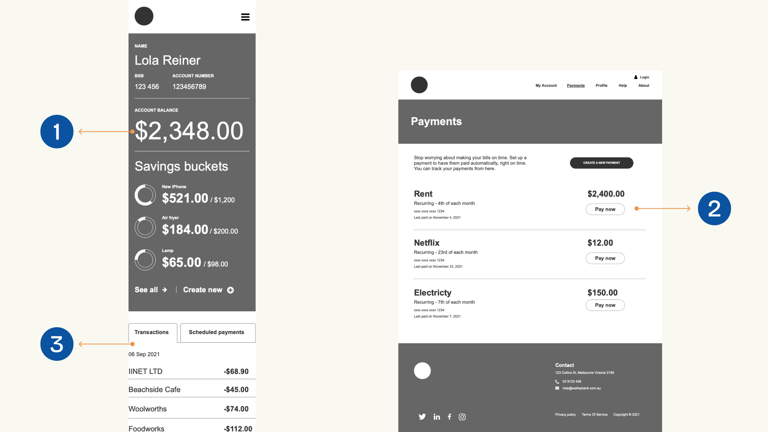
The UX team provided the top three insights from their tests on the lo-fi wireframes. These insights highlight areas for improvement.
The insights
The account balances appear too large
Users can't edit the payments
Users can't view transactions for savings accounts
UX insights
The first hi-fi prototype was created
With these initial UX insights in mind, I started the design process by creating the UI flow, followed by designing the hi-fi wireframes and building the component library. This iterative process continued until the first prototype was ready for testing.
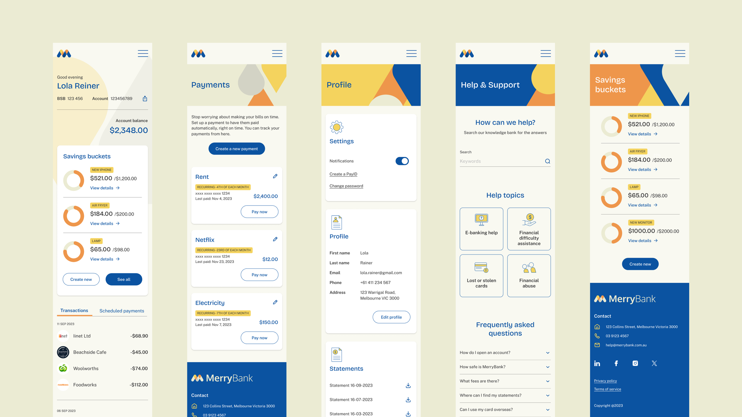
Mobile prototype
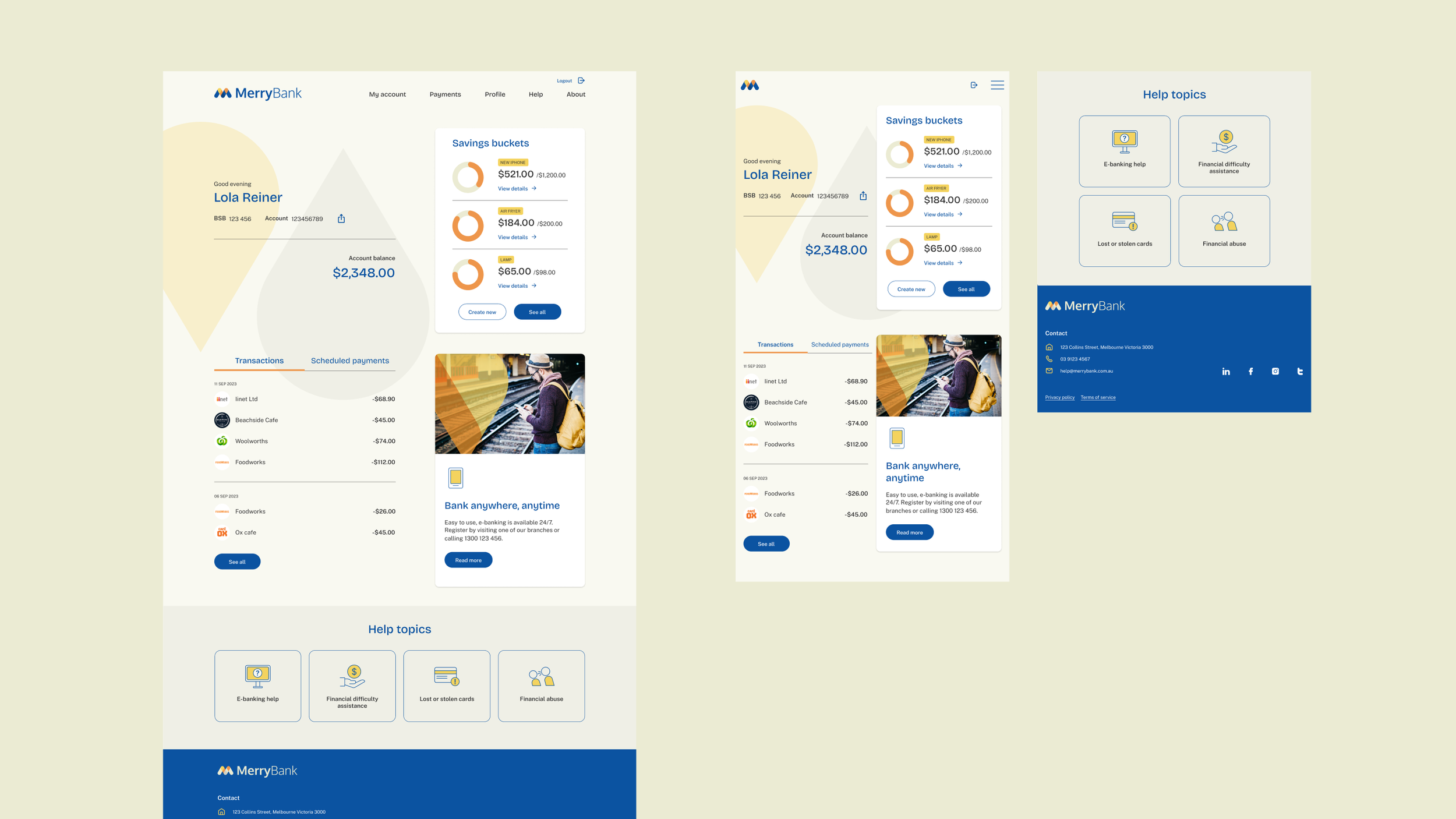
Desktop and tablet prototype
User testing insights
Participants and methods:
6 banking app users: 5 females and 1 male
4 moderated remote testing and 1 unmoderated remote testing using Maze as a tool
Key Insights
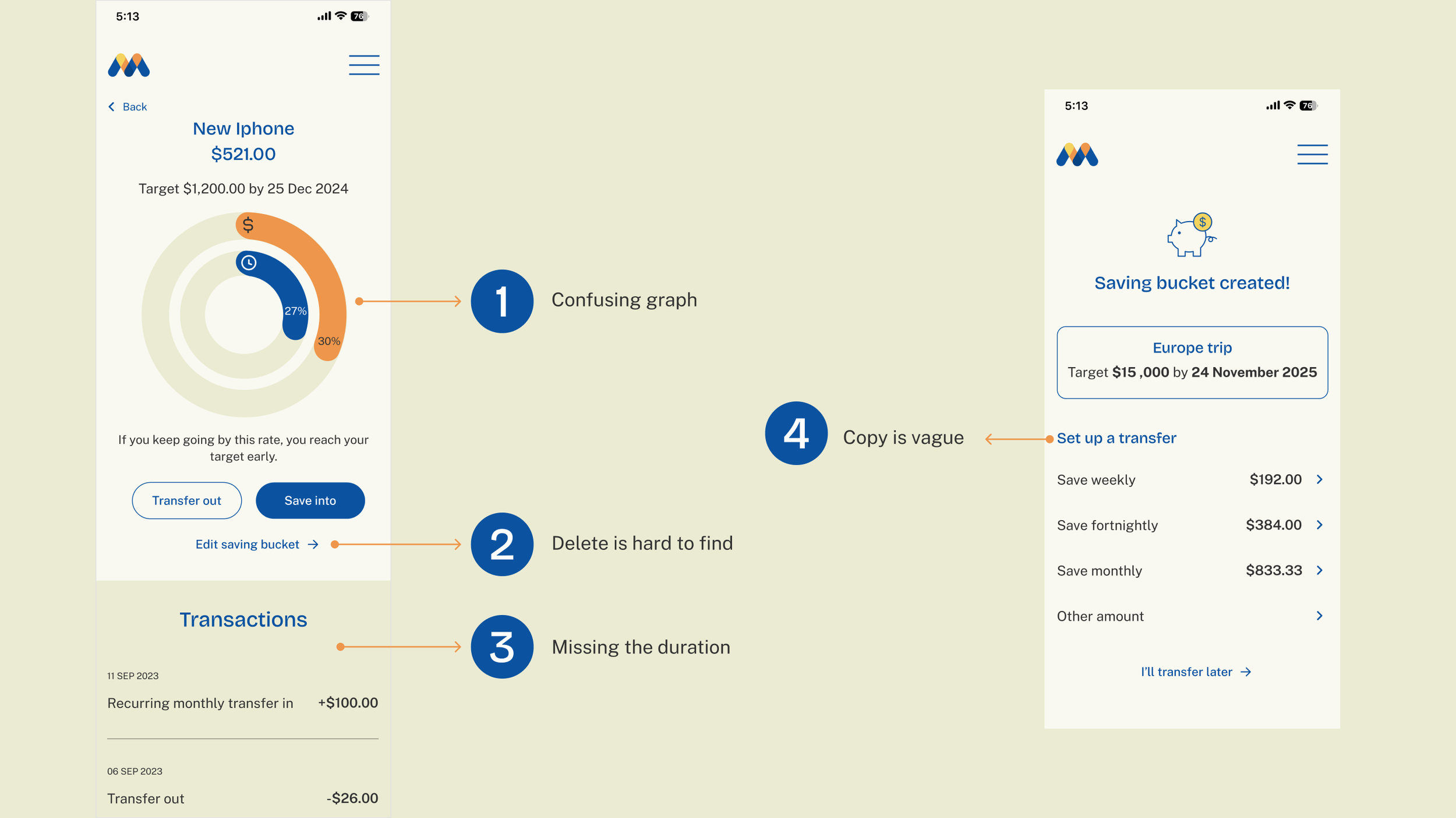
Users find the graph confusing, especially the relationship between the blue and orange circles.
The steps to delete a savings bucket need to be clearer and simpler.
Transaction details need a filter to show durations.
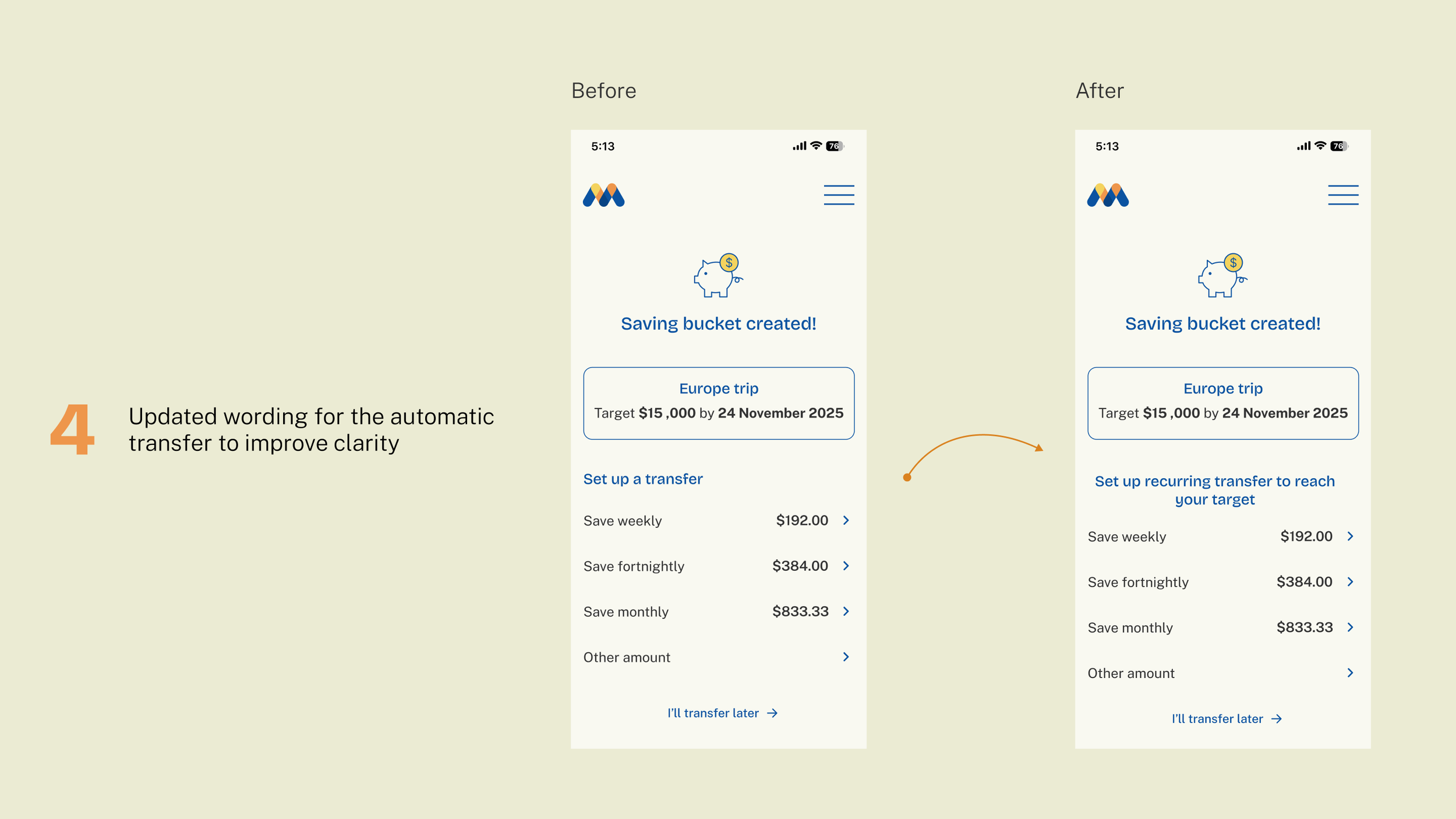
The "Set up transfer" copy on the automatic transfer page is too vague.
User testing insights
Key challenge: data visualisation
I further explored data visualisation options and conducted additional testing with the same interview participants.
They found the dollar and time icons confusing, but preferred the donut chart's look and feel over other options.
They thought the legend copy was too complicated.
Based on their feedback, I reiterated by using the donut chart from my initial design and adding legend for clarity. I’ve also improved the copy to make it more concise.
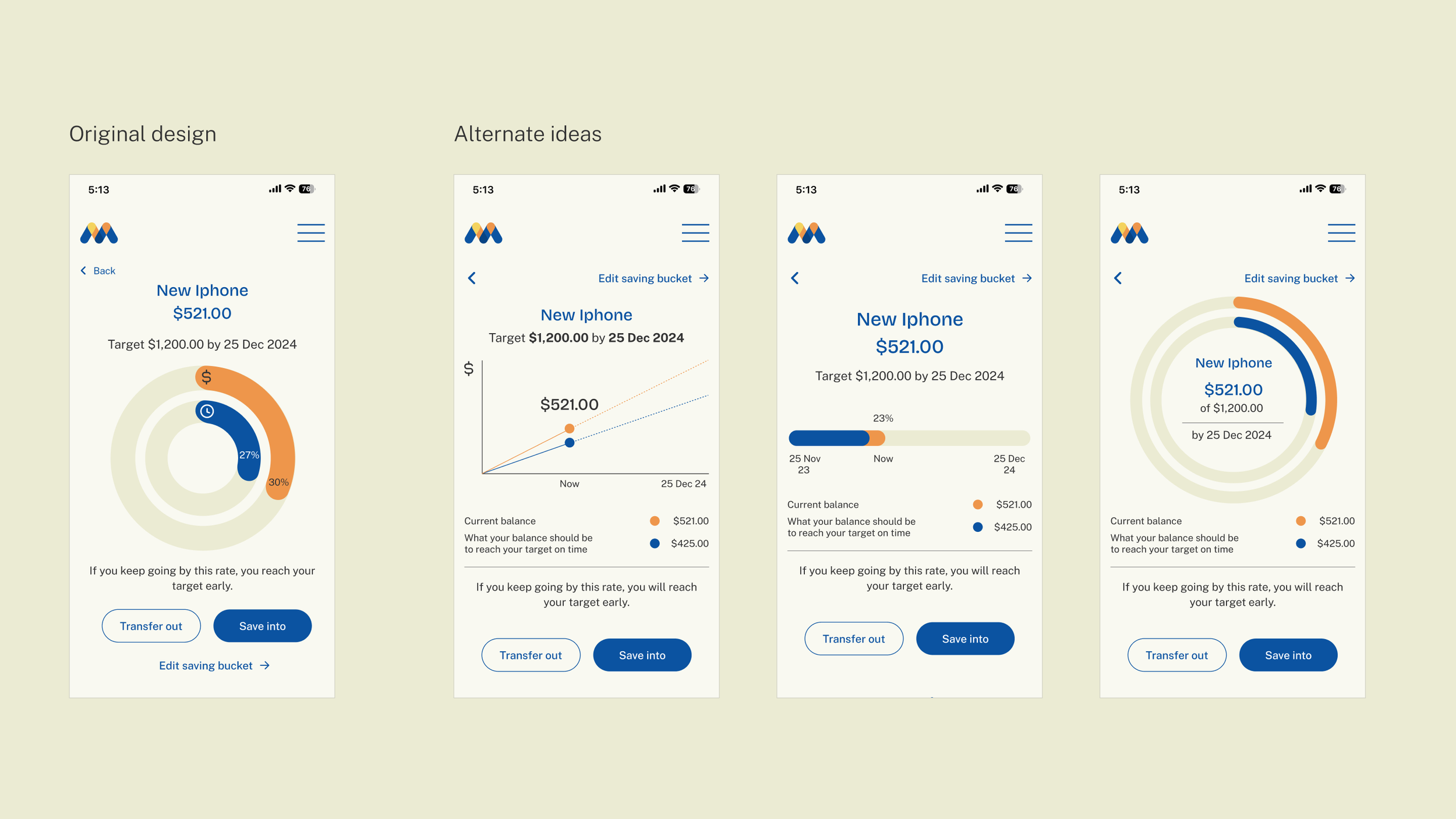
Further exploration for data visualisation
Solutions
How I addressed the problems:
Enhanced graph clarity by adding legends and removing unnecessary, confusing icons.
Increased the prominence of the edit button by moving it to the top right.
Incorporated a duration filter in transactions.
Improved the message clarity on the automatic transfer page by updating its copy.

Solutions

Solutions
Solutions
Final prototype
Learnings
Be prepared for unexpected results. User testing may challenge your assumptions — stay open, iterate, and don't hesitate to refine or rethink the original idea.
Sometimes, the first idea is still the best solution, but it just needs further explorations and fine-tuning.

