Origin Energy Bill
How I redesigned Origin bill and created digital assets for the launch.
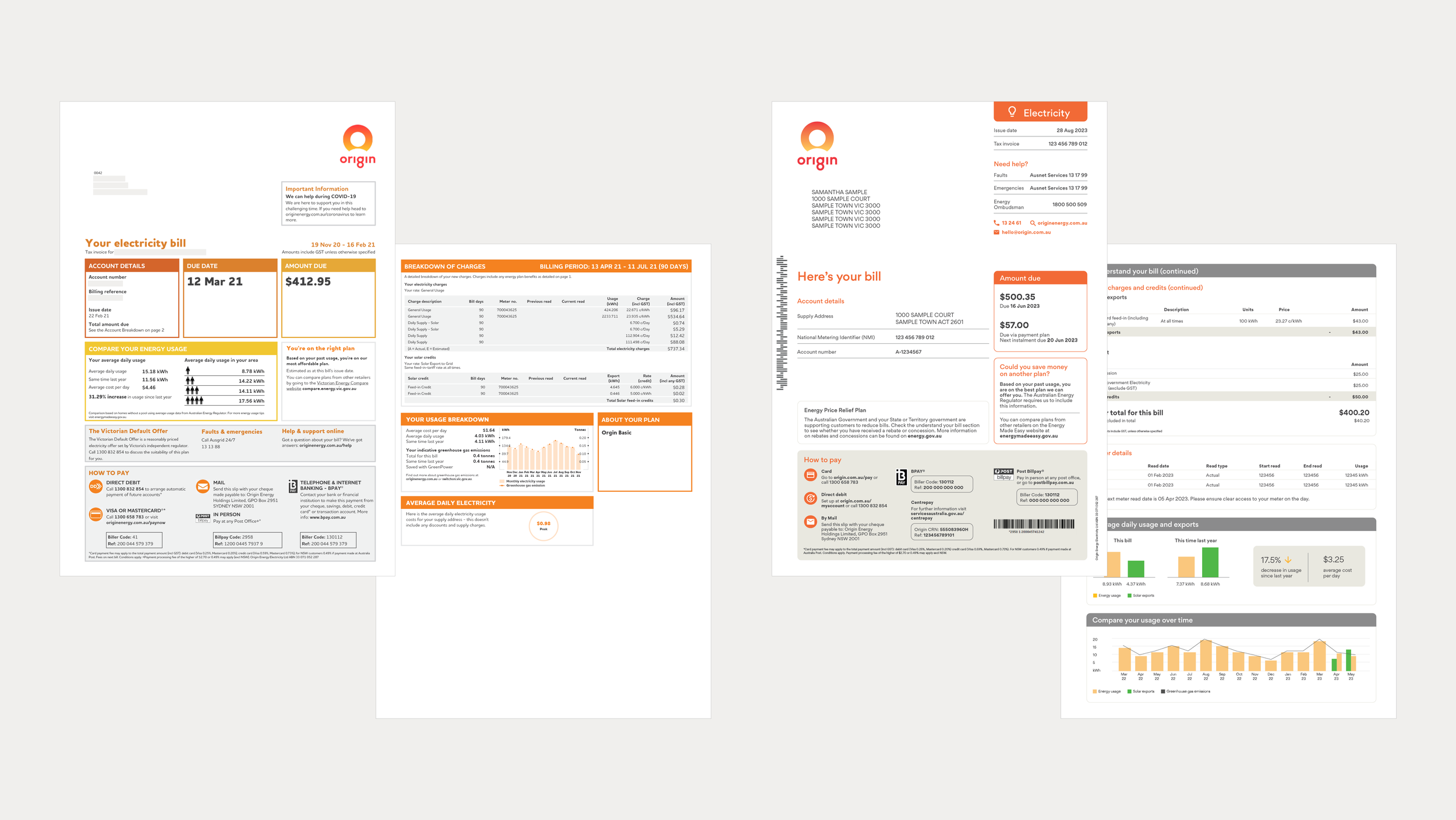
During my tenure at Origin, the Australian Energy Regulator released new guidelines for energy bills nationwide. As a result, we needed to redesign our energy bill.
We wanted to use this opportunity to find out what could be improved, especially since the bill design hadn't changed for over seven years. The visuals no longer aligned with our brand, making this an ideal time for a brand update.
My role
Visual Designer
Competitor research, graphic design, mixed media design, style guide
The team
CX Designers
Business Analysts
Developers
Strategy Marketing Manager
Deliverables
Digital and print PDF
Digital assets for website and blog
Outcomes
Compliance with the new regulatory billing guidelines
Improved accessibility
Improved visual clarity
Brand uplift

Redesign based on research insights
I collaborated with the CX Designers to design the bill layout. They created the initial wireframes, and my role was to refine these to ensure they were on brand, and to fine-tune details such as typography, colours, and visual hierarchy.
The CX designers conducted quantitative and qualitative research, and we used the insights gathered to continuously refine our design. These surveys and interviews compared the old and new bill designs. We asked 15 current customers questions about how easy it is to find the information they are looking for, what works well, and what they wanted to improve.
These are the main things that were implemented:
Improved hierarchy on the first page
New colour palette is chosen for better readability
Removed unnecessary boxes and tables for a cleaner look

Before and after
Developer handoff
I refined the design and created a style guide for the bill, which was then handed off to the developers. I was also responsible for monitoring the developers' progress to ensure that the build aligned with the design.

Style guide

Launch visual concepts
After completing the bill design, I created the launch visuals. I wanted the design to include visual cues about the bill while evoking a sense of comfort and user-friendliness. Additionally, I ensured they adhered to Origin's mixed media guidelines.
The chosen concept was then applied to the Origin website, a new bill explainer video, and the blog page.


