Colour Accessibility Improvement Project
Accessible design
Design operations
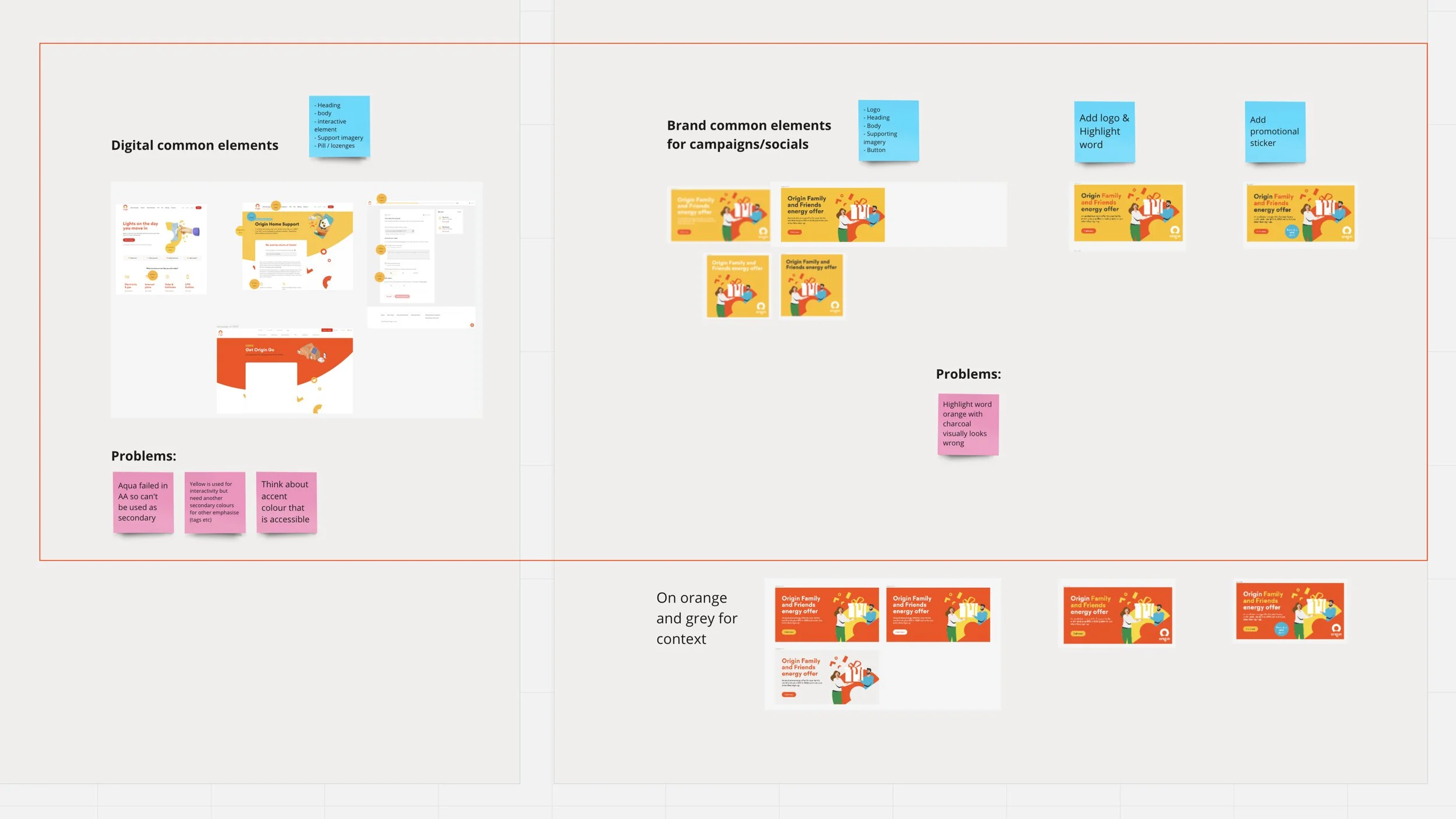
Shortly after joining Origin, I identified that there is a discrepancy between the brand team’s colour palettes and the UI/UX team’s colour palettes.
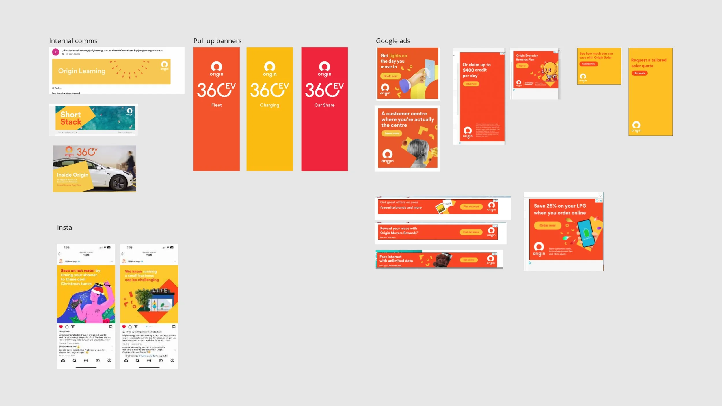
Some of the brand colour combinations which were originally built more for advertising and print are not in compliance with the Web Content Accessibility Guidelines.
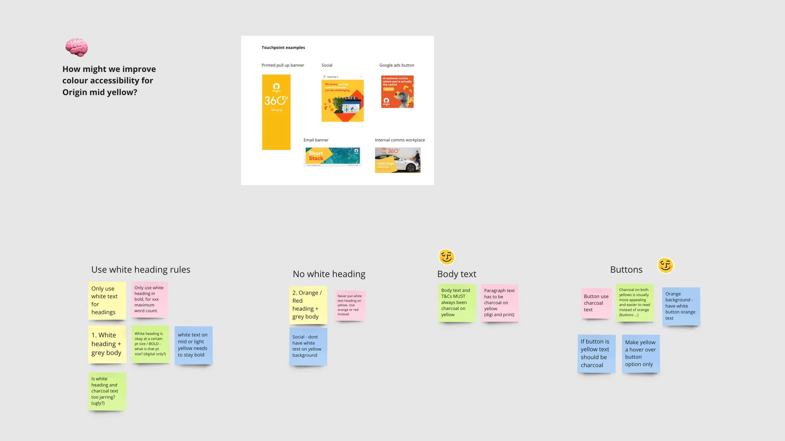
I took the initiative to lead an improvement project for Origin brand colours to be more accessible, and ultimately aim to merge the two colour guidelines into one.
This project involves research, team workshop facilitation, solution ideation, and implementation planning. I work closely with the Design System Lead and we are now in the testing stage of implementing a new set of colour pairings for marketing and creative touchpoints.


